My eye was hurting. It had been hurting for weeks, actually, nearly every morning. Urgent care said I had a corneal abrasion and if I just kept the eye lubricated it would heal on its own. That wasn’t the whole story, but I didn’t know that yet, and since this is the story, and we’re at this point in the story, you also don’t know that yet.
Anyway, I was thinking about the song “Poke” by Frightened Rabbit.
I remembered that a little over a decade ago, having recently discovered that I was not as artistically incompetent as I’d assumed, I embarked on a project to create illustrations for some of my favorite songs. “Poke” was the second one I drew, as it practically designed itself.
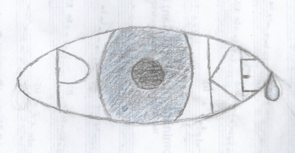
I wondered, what would it take to convert that drawing into data Logo could understand? Well, it turns out quite a lot.
- Photograph/scan the drawing (this I’d already done for my previous website that I’m not embarrassed about at all and incidentally doesn’t exist anymore and don’t go looking for it on the Wayback Machine it’s not there either.)
- Remove the background from the image because that artistic choice is going to make the coordinates too noisy.
- Convert the image to SVG format. There are many sites that do this but the first one I find that’s free is https://www.adobe.com/express/feature/image/convert/jpg-to-svg which it turns out will be lucky for reasons I didn’t know yet so you also don’t know yet. SVG is used for vector graphics (you’ll never guess what the v and the g stand for), which rather than encoding a single static display of the image as a JPG, encodes all the information a computer needs to generate the image in various environments, including coordinates. Logo’s graphics, in the program itself (which is to say, before you export them) are vector graphics, though not SVG. Also if any of that is wrong you can’t sue me I’m not an expert.
- Open the SVG file in Sublime Text and find out that SVG doesn’t actually encode coordinates it encodes paths and those paths look nothing like Logo paths and definitely nothing like Logo coordinates.
- Look up how to convert SVG paths to XY coordinates. Find out it’s probably really hard, but fortunately someone already did it for a Spotify ad for some reason. So that’s now 2 companies I kind of hate that are involved in this but at least Coördinator is open-source.
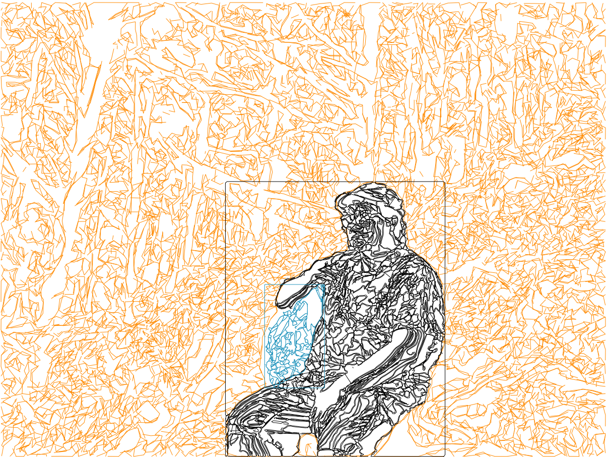
- Convert the SVG to coordinates and play around with the settings until you get something that looks like it won’t be a mess when you try to draw it.
- Download the coordinates as a JSON, open in Sublime Text, remove all the commas, and you’ve got yourself a Logo list.
- Write a Logo procedure to iterate through a list of coordinates and draw the corresponding image. *sticks code in oven, pulls out one he wrote the previous year for a secret project*
- Find out the coordinates are upside down and there are a bunch of lines you don’t want.
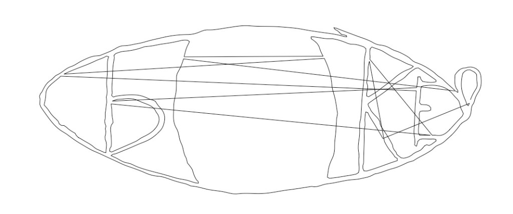
- Go back to step 3 but before you convert the image flip it upside down. Then do all the steps again.
- Realize that the problem is the way it’s being vectorized means the coordinates aren’t listed in the same order that you’d want them to be for drawing, so the pen is occasionally jumping across the image to get to the next coordinate, creating those zigzaggy lines.
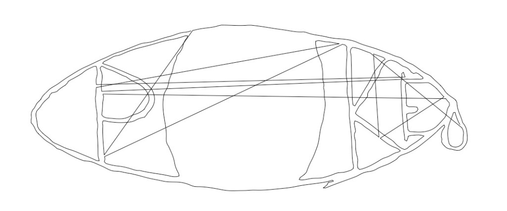
- Write a Logo procedure to make it so the pen doesn’t draw if it’s having to jump a big distance. Be shocked that you get it right the first try.
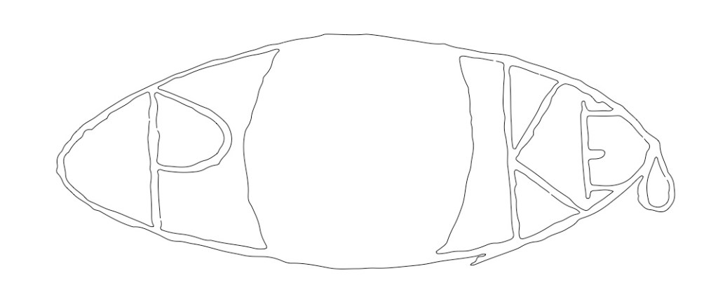
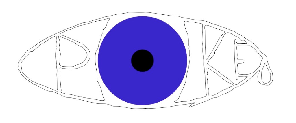
- Realize that this isn’t exactly going in the direction you wanted but just for completionism spend 2 hours wrestling with ACSLogo’s fill commands.
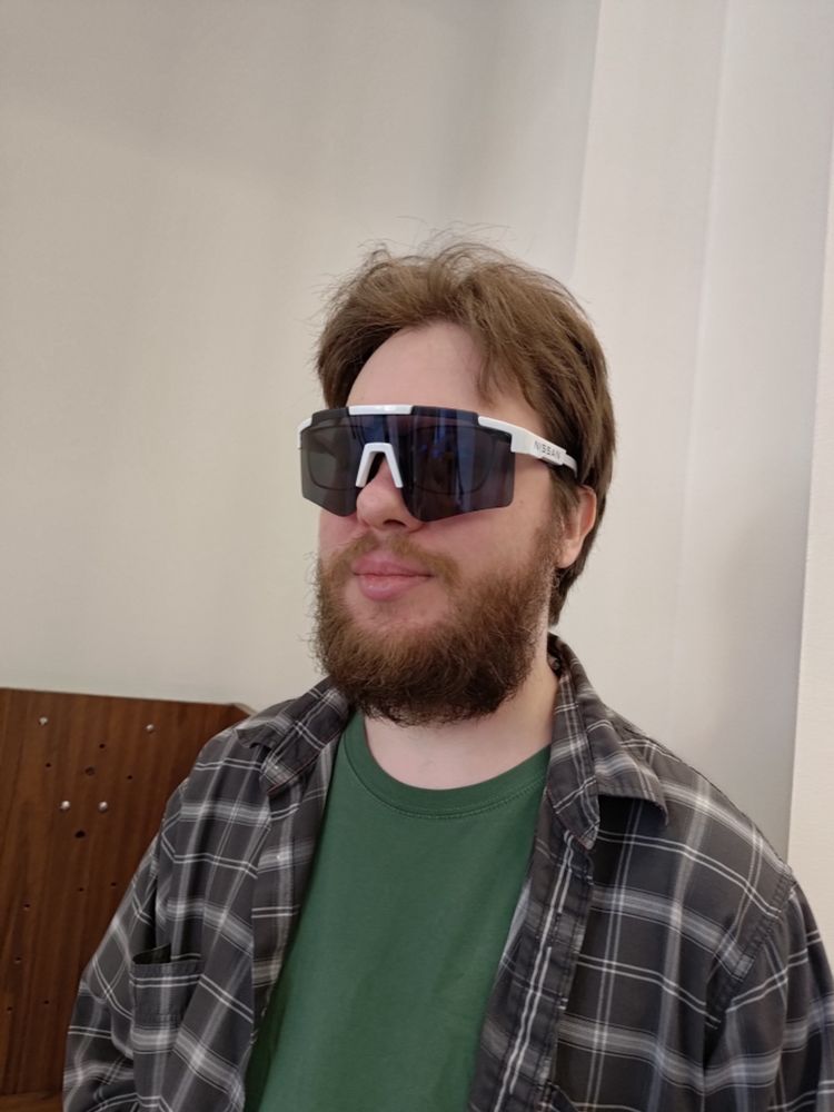
- Find out your eye situation is way worse than you thought and go the ER. Never ask me how to do anything, all of my tutorials end in injury.
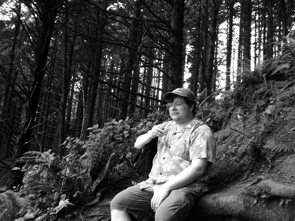
So yeah, turns out I actually had a “recurrent corneal erosion” which you can go ahead and look up for yourself because I’m trying to keep this light, but suffice it to say I was basically re-injuring my eye every time I woke up, and eventually it got really bad. The ER referred me to an ophthalmologist, and the next day my roommate stayed home so he could help me get there. I basically couldn’t open my eye for more than a split second at a time due to the pain (even closed it was excruciating), and bright light made it even worse. Fortunately, my roommate had worked on a project for Nissan and had these big goofy sunglasses which fit over my regular glasses and were even big enough to keep out most of the light from the sides. I ended up wearing them for the next couple weeks because I am a fashion icon. The only reason I’m mentioning all this is because otherwise this next image isn’t going to make any sense.
A couple months later I can finally look at my screen for more than 30 minutes at a time without it hurting. I decide that maybe I’m not actually that interested in using the above process fro drawings, but what about other types of images. Just as an experiment so see what it looks like I grab a screenshot I recently took of a A Bit of Fry and Laurie Laurie clip and run it through the process.
So, you know, not exactly what I was looking for, but I don’t hate it.
I mess with the code a bit and manage to get a slightly more accurate transcription…that I’m not gonna include here because 1) I would have to explain the bit and that’s not really relevant, and 2) what I realized was I wasn’t super comfortable using someone else’s image for this, it was very “discount Andy Warhol,” you know? So, having worked out all of the kinks, I reach for another recent image that I feel a little more ownership over (after asking my roommate’s permission.)
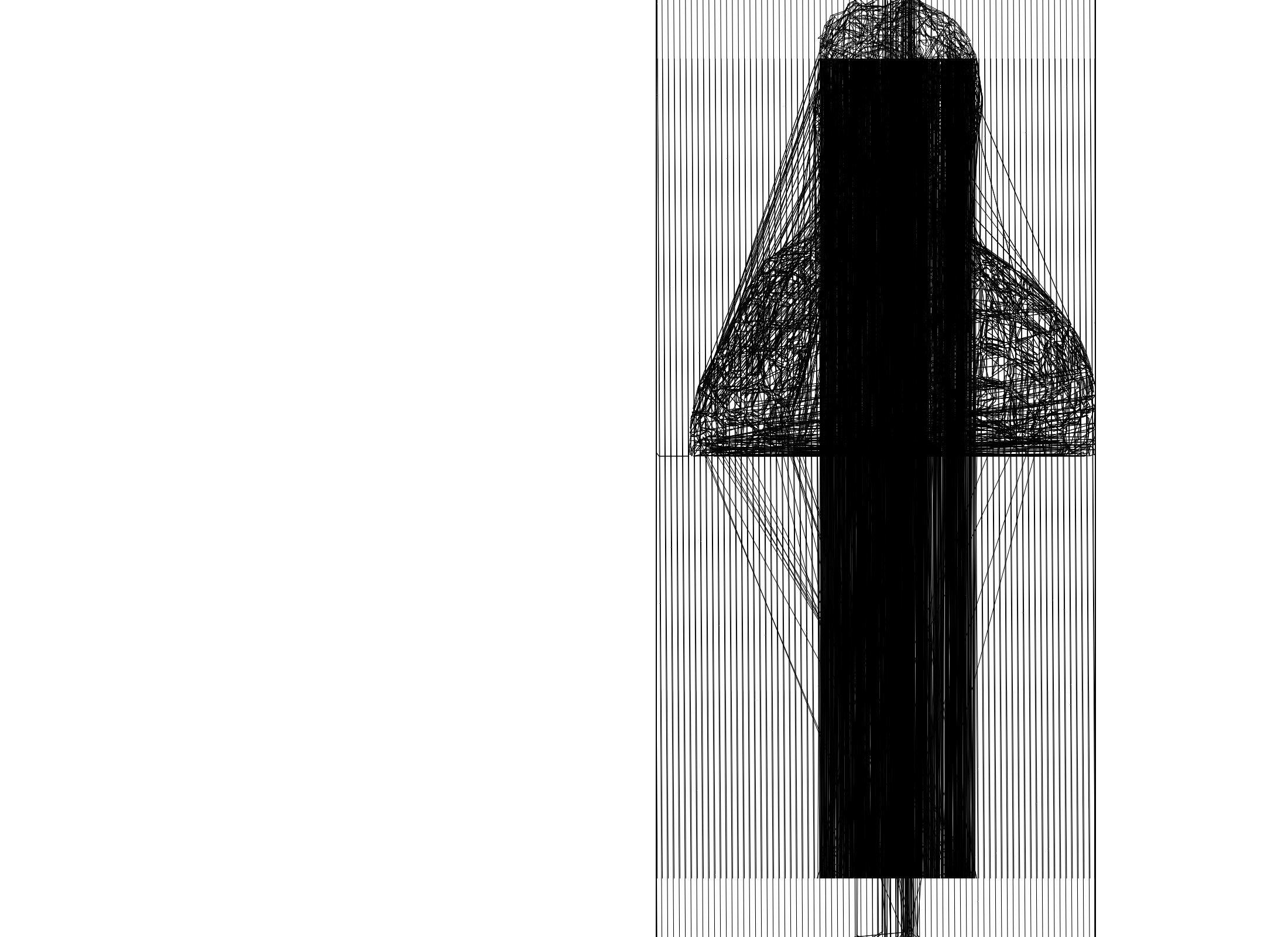
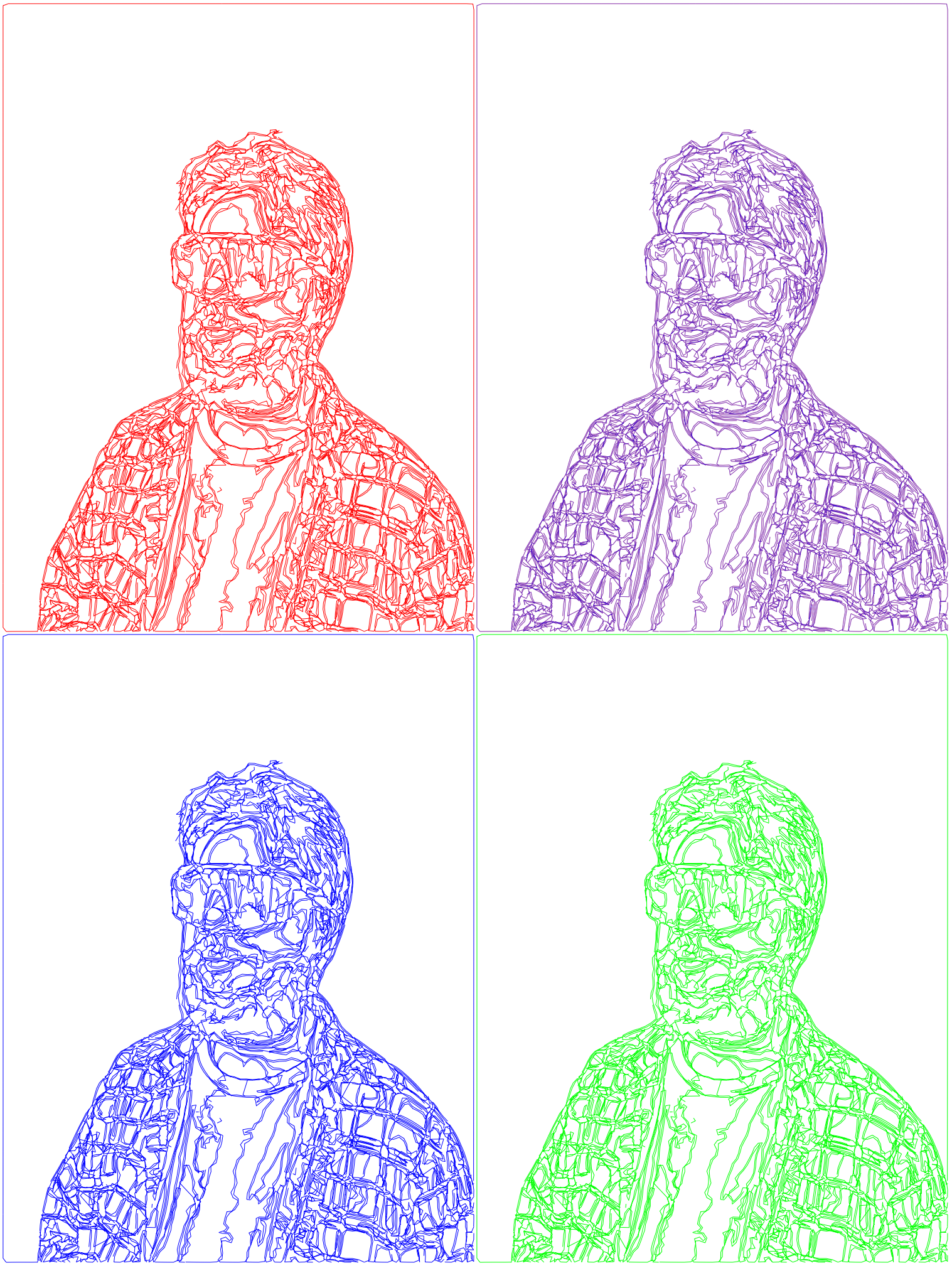
So maybe I hadn’t worked out all the kinks.
Ok, I really got them this time.
How did it get worse?? (jk, this one was on purpose, this and the first vertical one are actually my favorites)
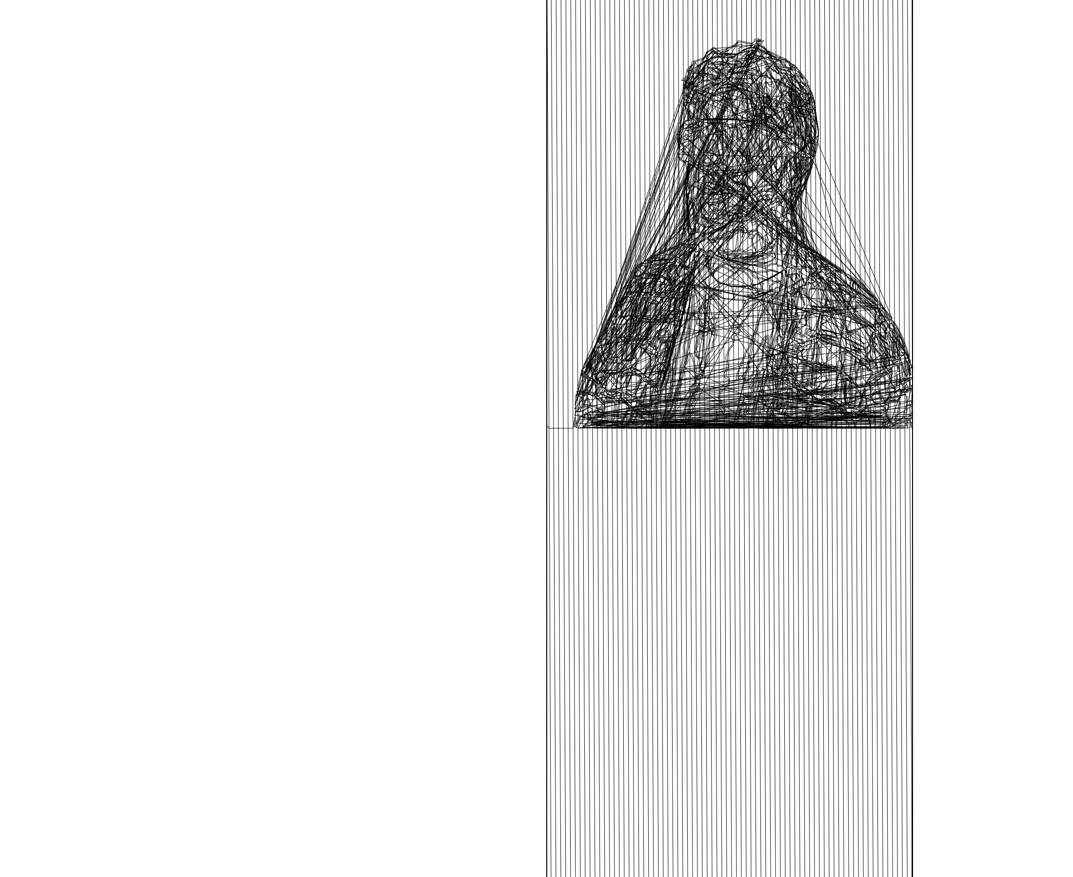
Ok, for real this time.
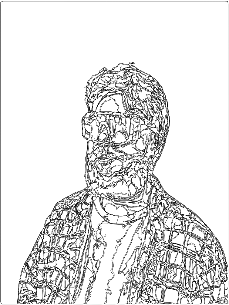
Honestly, I do not like looking at myself, but this is pretty cool. That being said, why am I just doing these in black-and-white?
Who said what about discount Andy Warhol, I don’t remember that, do you?
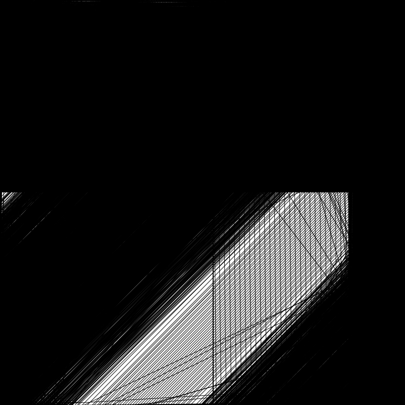
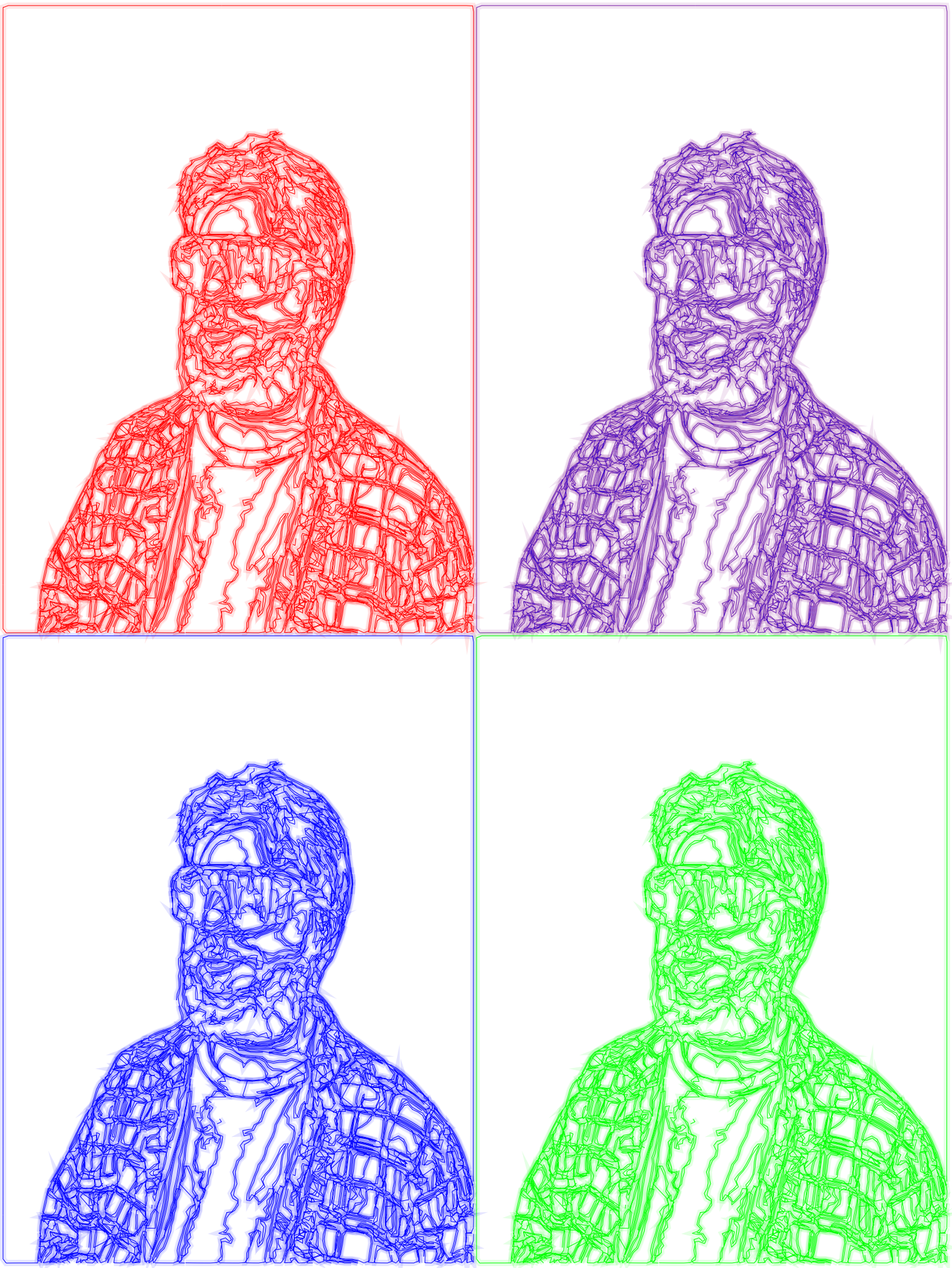
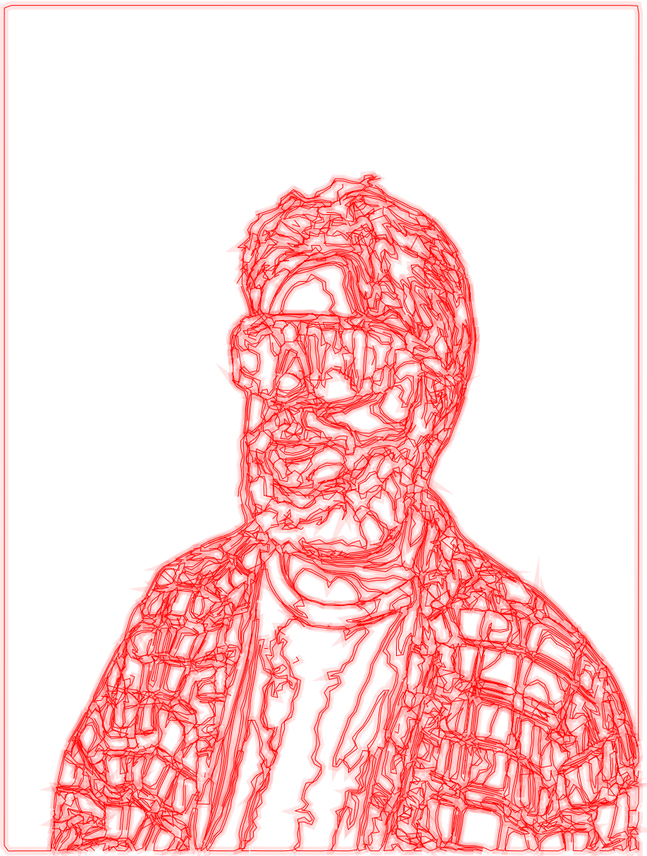
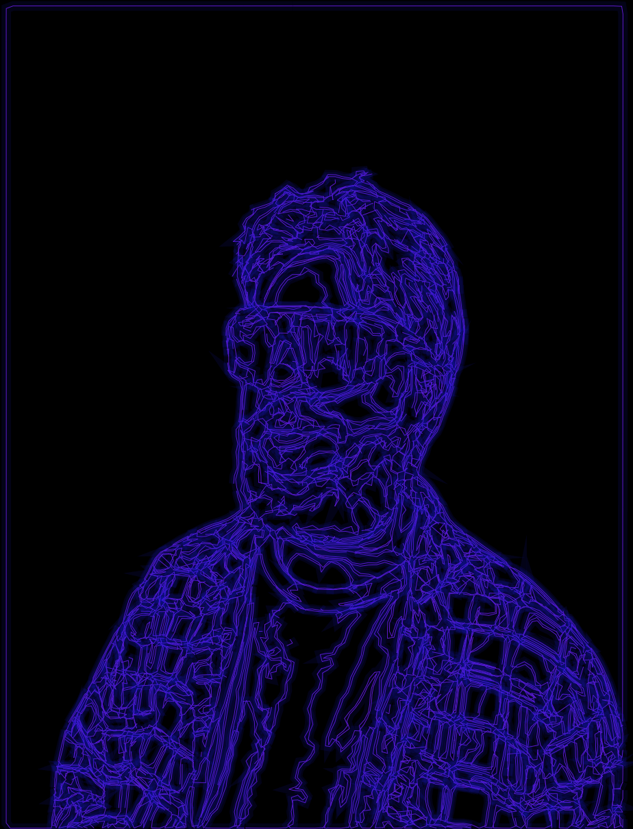
A few days later, for some reason, I had the thought “What would happen if I retraced the image with a second line that’s thicker but has lower opacity?” and the answer is the 80’s, the 80’s happen.

At this point I was getting kind of sick of myself, so I decided rather than use a photo my roommate took of me I’d use a photo I took of him.
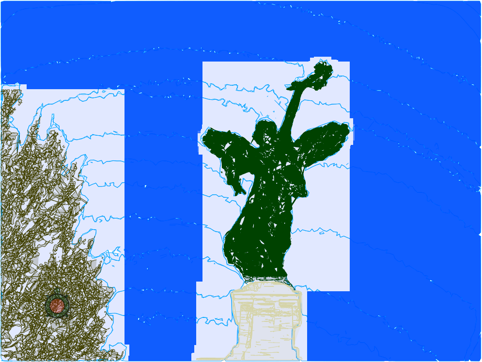
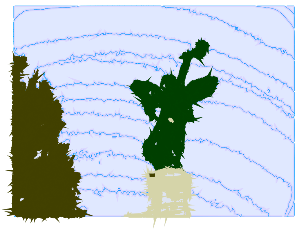
For this one I wanted to try a composite technique so that I could do different parts of the image in different colors (because of the way the coordinates are laid out I can’t just have Logo switch colors while it’s drawing unless I figured out the exact outline, in coordinates, of the part I wanted to be a certain color and had it check every time it was about to draw whether the coordinate it was going to was within that boundary and that seemed way harder than just cutting out the pieces of the image in Preview.) It worked surprisingly well, but had these kind of annoying boxes around each piece of the image.
The frames were, it turns out, Adobe’s fault. For some reason it treated the frame as separate from the background so even if the background was transparent in the PNG it would still put the frame in there when converting to SVG. I found other PNG-to-SVG converters which not only didn’t produce this error but were also just better than Adobe and provided more control over the final image, but for reason the SVGs from these services tended to not work with Coördinator, possibly because they were actually too complex.
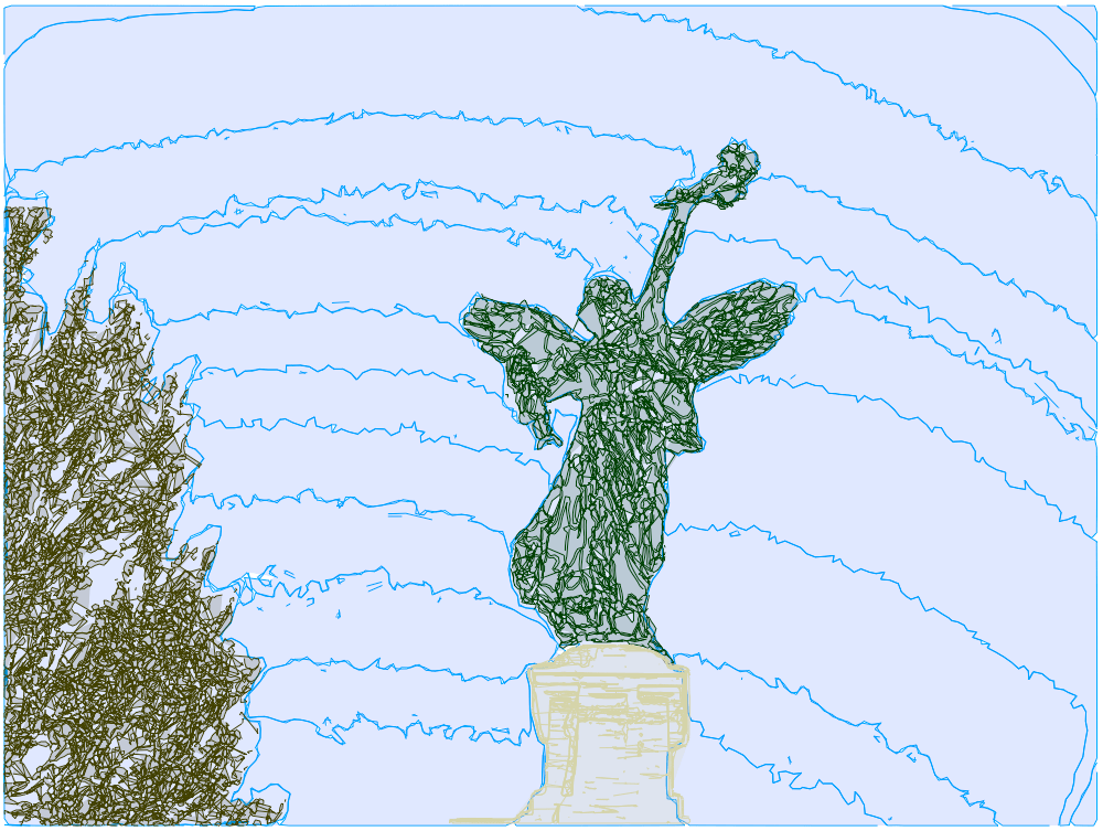
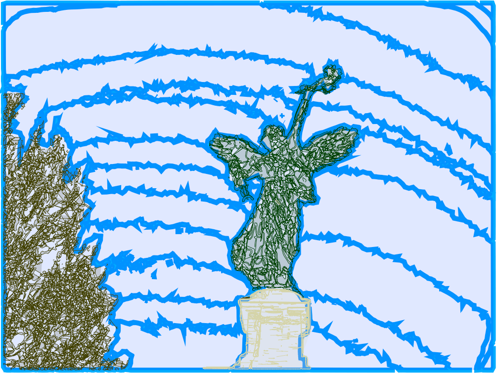
I nearly gave up, but it then occurred to me that I could edit the SVGs before passing them to coordinator and remove the background at that step, leaving no frame. And as luck would have it I chose to do this experiment with a different image that only had one tree, which is good because if I’d tried to do it with the above image I would’ve died.

Not content to merely fix a problem, I also decided I wanted to color in the spaces with a low-opacity color just to see what that looked like. And at first what it looked like was…not promising.
At first I thought the problem was with ACSLogo’s fill commands, which I’ve had trouble with before. But even when I drew solid boxes to make sure there was no leaking I was still getting these glitchy results. Finally it occurred to me to see what the actual exported image looked like…and it turned out it looked fine! I think I’m just doing stuff with ACSLogo that it was never meant to handle.
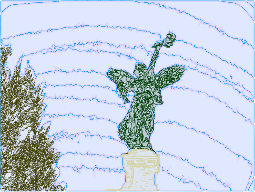
I of course now wanted to try adding the neon effect from earlier, but the thing is that my procedure for drawing from a coordinate list is really slow, so every time I redrew something it took a solid 5 minutes, and it was getting kind of tedious. But I realized that once I’d drawn something once, as long as I wasn’t going to change any of the physical dimensions of it I could just store that path and have Logo draw from the path next time, which takes at most a few seconds. And if I save that path in a document that I can load in later then I don’t even have to redraw it from coordinates at the start of every session.
Sorry, that was a lot of technical stuff, here’s some fun goofs and the final neon version.
Well, it turns out even with all that time-saving innovation it still felt really tedious to do more of this, especially the background removal bit. The big problem is that I’m driven less by wanting to make art and more by wanting to figure out interesting ways to make art. So once I’ve figured out the process my motivation just kind of burns out until I find something new to d—oh, wait, I forgot I did actually figure out something else I can do with this.
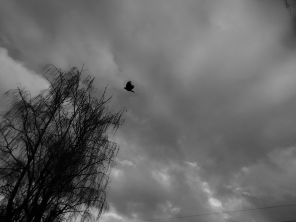
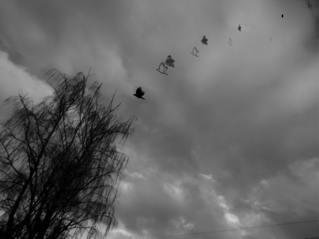
I was messing around with some birds I’d clipped from this photo:
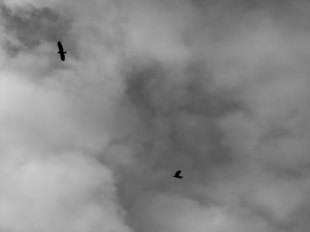
And it just wasn’t looking good. Then I had the thought, what if I overlay the drawn birds on top of the photo? And then what if I write out some lyrics and scan that and take out the background and then overlay that as well? And it looked really good but I made it for someone so it would feel kind of tactless to share it publicly.
But I still wanted to show off the technique so I made another version except I never got around to adding a written component to that but I did figure out this cool effect with splitting the fill from the border and doing some transformations on them, so:
And now I’m once again in a bit of a fallow period with Logo while I wait to have an idea for something weird to do with it. (Although I do actually have something I want to try but it’s part of a larger project and would basically just be using these techniques.)
Hope you enjoyed this installment. No idea what, if anything, comes next.
