
NB: All of the designs of U.S. currency discussed in this ramble are from series 2009 or later. Also, I’m just dealing with paper money here, because the coins are too small to really bother me (although it is interesting that the most consistent theme is Lincoln, on the penny, just as it is in paper money, with the five). I will say that Euro coins look a lot cooler than ours.
The fact that pieces of paper have power isn’t what bothers me about money. I can understand pieces of paper having power; a lot of power resides in language, and paper is a common vessel for language (not to mention art, though the two are not, I think, unrelated, especially in this context). But U.S. bills are just weird.
Take out a one dollar bill, right now, and look at it. Isn’t it really weird? Like, a bunch of random stuff sort of thrown together, with little in the way of unifying design scheme or symmetry. Just ones and pyramids and IN GOD WE TRUSTs splattered all over the place. The higher denominations are a bit better thematically (the fives especially, with the Lincoln Memorial on one side and Lincoln on the other) but the numbers are even weirder. Now it’s not seven different styles of representing the number (I’m counting numerical and textual) on a single bill, it’s ten or more, to the point that the twenty looks like it’s advertising a theme park, and the hundred dollar bill looks like it’s from a special “Patriotic Edition” of Monopoly. Not to mention there are places where you’ve got at least three different things stamped on top of each other (the ten is the worst in this regard).
Now, obviously, part of this is security. These bills are supposed to be difficult to fake. But take, for example, the EURion constellation. On U.S. currency, these are the little yellow numbers that appear on the higher denominations. Contained within this arrangement is a pattern of circles that some photocopiers can recognize, causing them to refuse to copy the bill. On our bills, these are just thrown on wherever there’s space. Other countries, however, have incorporated them into the design, e.g. as flowers, or arranged aesthetically with other circular elements. So, they don’t have to look like the Lincoln Memorial is being attacked by bees, is what I’m saying.
One might also argue that, since you’re seeing these images all the time, they’re supposed to impress on you some message about American values. But the only message I get is that we’re kitschy and disorganized.
Which brings me to what, I think, is the larger problem: good ol’ American individualism. Many have noted that U.S. State flags are a mess (not to mention city flags). They’re all designed by committees and contests, with no unifying features between them, and a whole lot of random all over them. Kinda like our money.
(sidenote: I may be biased, but I think the Michigan state flag is one of the better ones.)
Meanwhile, look at Australia. Australia has states too, in case you didn’t know, and all of their flags are the same basic design: the Union Jack in the top-left corner, and a small identifying symbol on a circle in the center of the right half. (There are two flags that differ, but not by much, and they themselves share a basic design, so there.) Now, to us USians, there might be something a little distasteful about that amount of uniformity, especially as it’s clearly a result of EMPIRE, which we are definitely against and have never ever participated in. But take a look at Australian money:

(EDIT: The following joke refers to an image that no longer exists and had to be replaced. The joke has been kept in because it’s funny. Just imagine the image above but with “YAY” slapped on it in big, semi-transparent capital letters.) There’s a reason that image says “YAY” on it, and it’s not because that’s a watermark preventing you from using the image without signing up for something. No, it says “YAY” because Australian money is so well designed it makes me want to move there right now just to trade in my bizarre U.S. Monopoly money for their Skittle-flavored funtime paper. This is definitely the next step up. Of course, I don’t know enough about Australia to know if the stuff they put on there actually makes sense together, but at least there is a bit less theme-park cartoonishness, and a bit more consistency in the design.
The ultimate in currency design, however, is the Euro:
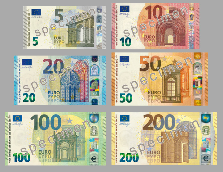
This image does not say “YAY,” because this is not money that you get excited about. This is not Skittles. And, unlike Skittles, it will not not give you a stomach ache after you eat the whole bag in under an hour. This is money that you can be satisfied with. That you can look at every day and say, “This is good. This is right.” It is understated, dignified, yet still creative. I would hang out with this money. We would have good conversations.
Now, I’m not advocating that we join the European Union. For one thing, I don’t think we’re eligible. For another, the Euro currently stands at 79 cents to the U.S. dollar, and while I’m not an expert at economics, I think that means we’re winning. I am saying, however, that if we’re going to give these pieces of paper so much power, why don’t we make them look like they deserve it.
(Also, my conclusion that the Euro is the ultimate in currency design is not based on a comprehensive survey of every currency in the world. So, you know, grain or two of salt. Still, I really like the Euro.)
(Also also, this was originally written several years ago, and I haven’t updated the currency exchange rate because it would make the joke less funny.)
